PMC chart — how to read it and manage your form
The Performance Management Chart (PMC) is one of the most important tools in data-driven cycling for planning your season. It tracks training load — usually as TSS (Training Stress Score) points delivered by your power meter (e.g., Assioma pedals or a KICKR trainer). Here's how to interpret this chart and steer your training in practice.
1. The three key metrics
Fitness — blue line (CTL)
CTL (Chronic Training Load) is your long-term fitness "base." It represents the average daily training load over the past 42 days. It rises slowly and falls slowly. The higher the value, the more training volume your body can handle — crucial for longer rides like 70 km routes at a strong pace.
Fatigue — orange line (ATL)
ATL (Acute Training Load) is your short-term fatigue — typically the 7-day average. It reacts very dynamically to every workout. Hard intervals or a long road ride — the line shoots up sharply. Two rest days — it drops quickly.
Form — grey dashed line (TSB)
TSB (Training Stress Balance) is a simple equation: Fitness minus Fatigue (from the previous day). It indicates whether you're "fresh" on a given day or struggling with accumulated fatigue.
2. How to use it in practice?
The chart helps you manage two main phases: building fitness and preparing for a target event (tapering).
During a training block (base building)
When you're training regularly and want to raise your fitness, your grey line (Form) should sit at negative values. The "sweet spot" for adaptation is typically a TSB between -10 and -30. You're tired, but the training stimulus is right for the blue line (Fitness) to keep rising.
Warning: if the grey line drops below -30 and stays there for an extended period, you're entering the high-risk zone for overreaching or overtraining. At these moments it's worth monitoring recovery metrics (like HRV) to make sure your body is keeping up.
Before a key ride / race (tapering)
If you're preparing for a specific event — say a local gran fondo (like a 33 km race) or a personal record attempt — you want to arrive at the start line with "fresh legs." You're aiming for a TSB on a slight positive, usually between +5 and +15.
How to get there? A week or two before the event, drastically cut volume (ride shorter, TSS drops) but maintain intensity so your muscles stay sharp. The orange line drops steeply, the blue line dips only slightly, and as a result the grey line rises above zero.
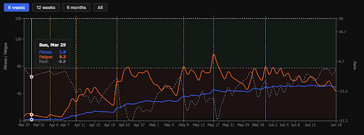
3. Analysing a sample chart
Looking at the screenshot above:
- End of March: starting from a very low base (Fitness around 1.9).
- April – May: clear training blocks visible. The orange line spiked sharply, pulling Form (grey line) deep into negative territory, especially around mid-May (dropping to the -30 region). That was the hardest training period, followed by a short recovery phase (grey line rising).
- June: Fitness (blue line) clearly stabilised around 40–50 points. A solid base is built and form is maintained at a relatively even level, as seen in the smaller fatigue fluctuations.
Train smarter with WattLog.pro
WattLog.pro collects data from your trainer and shows what's really happening with your fitness.
Try WattLog.pro for free →